
Though our personal bias is that Verve magazine possibly acted as the predecessor to all contemporary recurring art publications, it’s impossible to dispute that, at the very least, it was a propelling force in making Modernism accessible to the public and cementing visual culture’s importance in the mainstream. Now almost entirely faded from public view, the last publication - Verve: The Ultimate Review of Art and Literature – was published in 1988.


Verve Magazine, photo courtesy of the Greek News Agenda.
Teriade, a Greek ex-law student living in Paris, launched Verve with art publisher Albert Skira. The magazine was struggling financially almost from its inception, but made it until 1960, covering various sporadic themes – war, the Orient, Medieval manuscripts, James Joyce. It’s this encyclopedic and passion-driven coverage of various topics made accessible for public enjoyment that makes the publication so captivating. The covers by large names like Matisse and Chagall weren’t novelties but instead earnest works by masters still relatively “under the radar.”
Writes John Russell of the New York Times in 1988:
“But we have to remember that 50 years ago those painters had by no means the mandatory importance that they came to have later. Nor were they pushed into print by people who couldn't wait to make a fortune out of them. Auctions of contemporary art were virtually unknown. Prices had been stable for a long time, and the major artist was still a private person, unharried by the media.
For these reasons, Verve was really bringing the news when, in its first issue, it printed Dora Maar's historic photograph of ''Guernica'' in Picasso's studio. It also brought the news when it persuaded the great old men of the School of Paris to let it reproduce not just one or two new canvases but a whole corpus of recent work. After World War II, and before the exhibition industry had got fully under way, virtually the only way to keep in close touch with what was being done by Matisse, Picasso, Braque and Chagall was to grab the relevant issue of Verve. What may look today like automatic choices had at that time a revelatory quality.
James Joyce and Ernest Hemingway were early contributors, and the still young Jean-Paul Sartre made his debut as a writer on food (Neapolitan cuisine, to be precise). Matisse and Bonnard spoke off the cuff to Verve about whatever was on their minds; John Rewald allowed Verve to publish some letters from the young Cezanne to Emile Zola. Meyer Schapiro introduced Chagall's illustrations to the Bible, and in the 1950's the English novelist and reporter Rebecca West was invited - not with the happiest of results - to write on both Braque and Picasso.”
For these reasons, then, Verve was like an incubator of talent, a perhaps unwitting sleeper cell of cultural content being distributed to the public.
Verve magazine was a glossy, slippery publication, put in boxes for purchase. We were ecstatic to recently be able to treat two of these boxes at The Center. Brought to us darkened and embrittled with age, they exhibited minor distortion, with scattered handling dents, skinning, abrasions, and tears throughout, sometimes resulting in severe losses. The boxes were both covered in a heavy layer of surface grime and exhibited inherent age-related discoloration.


The boxes prior to receiving treatment.
The boxes were first surface cleaned to reduce grime using appropriate conservation methods and materials; then, the areas of surface skinning were consolidated using adhesive, and the tears were repaired with Japanese tissue and reversible wheat starch paste.


Using conservation-grade eraser crumbs to carefully remove surface grime from the pieces.
The losses were filled with mending papers and then retouched with color pencil pigment to integrate areas of abrasion.

Filling minor losses and retouching with color pencil.
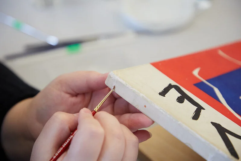
Tears were reinforced from the reverse with appropriate weight paper and adhesive.


The intricate process of reinforcing tears, particularly in the corners of the boxes.
While one of the boxes exhibited water staining, no reduction treatment could be carried out, as the boxes were constructed using coated, mechanically printed paper.
Returned to their original glory and conserved for years to come, these boxes serve as an important relic of the art publishing world, pushing Modernism into the mainstream.


The boxes after receiving treatment.